
Improving Accessibility and Content Orgainzation of HAD Website Through User Centered Design
UX Design · Metadata System Design · Content Design · WordPress Development
PROJECT OVERVIEW
The website of the History of Art and Design department at Pratt Institute urgently needed restoration and renovation because of a recent database and server crash. The temporary website was found to have problems with accessibility and information categorization. Extensive interviews with faculty and students informed the redesign, focusing on its lack of accessibility and chaotic information architecture. While restoring fundamental functionality, significant improvements were made to the overall visual style, website content system and accessibility. Collaborating with the team, I redesigned the metadata system and rebuilt the old website, resulting in increased positive user feedback about easier information seeking improved accessibility, and a 40% increase in user traffic in a short time. Constant updates reflect its ongoing evolution towards enhanced user experience and a more refined virtual presence.
👩🏫 Role
👥 Team
UX Designer
Web Developer
Jennie Lin
Chaeyoung Park
Isik Erturk
⌛ Timeline
🎨 Deliverable
Jan - April 2023
Design Process
1️⃣ Understanding the Product
Analyzed current website structure, content and technical issues.
2️⃣ Identifying Key Issues/Pain Points
Conducted user research with faculty, students and staff to pinpoint problems
3️⃣ Brainstorming Possible Solutions
Searched for suitable WordPress themes and sorted content structure .
4️⃣ Creating and Iterating Prototypes
Rebuilt the information architecture/metadata system and designed prototypes.
5️⃣ Building the Website and Testing
Implemented new information architecture and design on WordPress
Urgent Restoration and Renovation of History of Art and Design Department Website
After an unexpected crash, the History of Art and Design Department's (HAD) website, which hasn't been updated much in the last ten years, needs an urgent restoration and renovation. Although it was transferred to WordPress, the faculty was still not satisfied with the current website and would like to renovate it while the restoration was ongoing.
During the kickoff meeting with our supervisor (a staff of HAD), it was emphasized that we needed to prioritize the immediate restoration of the website and ensure its functionality and usability for all users, encompassing all HAD students, faculty and staff of all ages and abilities. The project was given a short timeline of 3 months.

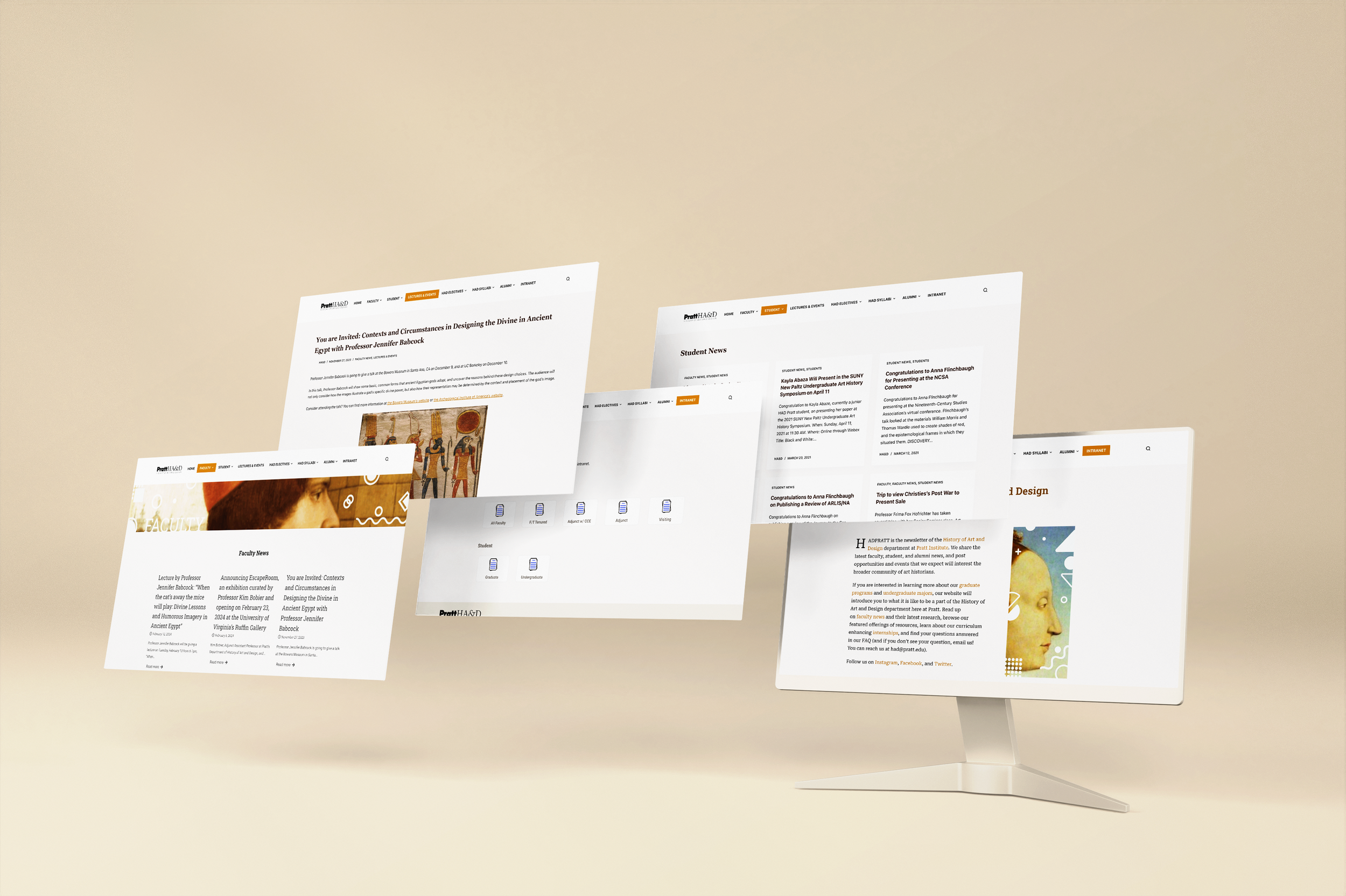
Homepage of the temporary HAD website

Teaching Resources page of the temporary HAD website

Intranet page for Graduate students
Functionality, Accessibility, Organization, then Aesthetics
After pinpointing the primary needs from the kickoff meeting, our next step was to delve deeper into the temporary transferred website, identifying key pain points reported by both faculty and students.
User Research
We reached out to five faculty, staff and students, and conducted interviews with them to learn about what they thought the previous website was insufficient and their expectations on the rebuilt website.

Interviewee demographics

Website Use Frequency
Here are several key insights that were pinpointed from the interview:
What faculty and staff said:
1️⃣ Upmost need: functionality
“I need to get the document I need ASAP… don’t want to search on the Pratt website.”
1️⃣ Distinct HAD identity on the website
“I want the website remained the similar style. They have been representing HAD very well”
2️⃣ Low accessibility e.g., missing alt text and low colour contrast
“Someone complained to me that we didn’t use alt text in previous images and that caused a problem for them.”
What students said:
2️⃣ Low accessibility, especially colors
“The yellow is too light.”
3️⃣ Chaotic content organization
“I don’t understand the file categorization. It’s hard to locate the one I need.”
Persona: Specifying different needs for students and faculty
At this juncture, distinct website usage patterns were shown among the two primary user groups: History of Art and Design (HAD) students and faculty. Students showed a less frequent use of the website than faculty members. As a result, we developed two personas to effectively address their pain points and integrate solutions in the subsequent steps.
Persona - faculty & staff
Persona - students
Accessibility emerged as a recurring pain point/need in nearly every interview conducted. We managed to access limited pages on the temporary site and conducted accessibility audits on them, adhering to WCAG guidelines as our reference.
Accessibility Audit: Examining the core accessibility issue among all violations
The most violated criteria are:
1️⃣ Guideline 1.1 Non text Content: there is rarely an image having alt text.
2️⃣ Guideline 1.2.2 Captions: audio and video content did not have any caption.
3️⃣ Guideline 1.4.3 Contrast: The current primary colour contrast was only 1.77:1.
4️⃣ Guideline 2.4.7 Focus Visible: Some links did not have visible focus state when tabbing through.
Pain Points integration
Synthesising all the findings from the research, the key pain points were identified as below:
🚨 Lack of essential features, impeding daily website usage
🚨 Inadequate accessibility, particularly in non-text elements
🚨 Disorganized website content, causing frustration in locating documents and information.
Question for us:
How might we redesign the HAD website to enhance its accessibility and simplify the information retrieval process for a diverse range of users?
Experimenting Ideas for an Educational Website
Since the website would be built on WordPress, I started looking for themes that were suitable for a natural transplant from the original site. Before the theme hunting, there are a few principles the team set up.
-
We first sorted the features needed by HAD website. HAD website should be a static website and it did not need too many interactive elements. We attempted to avoid bloated themes to prevent errors in the long run.
-
The theme was also expected to be accessibility ready. We wanted to make sure that the pre set of the theme could lay a solid accessibility foundation for us to minimise extra modifications, which had a potential to cause other system crashes within the tight timeline.
-
Because of the department’s nature, the website always contained more text content than imagery. We prioritize the consideration of hierarchy and clarity of text content, and how they can impact the construction of HAD identity on the website.
By applying these principles, I sorted out several themes and did a comparative analysis among all.

Key Design Decision: Organize content, instead of information architecture
The critical compromise we made in this project was not to change the information architecture of the original website. The faculty and staff, two of our stakeholders, expressed a strong will to remain the existing content and structure of the website when we proposed the changes to original site map for clarity purposes.
Considering the chaotic website content organization, we made a trade-off – instead of sorting the website’s information architecture, we turned to the content re-organization. We analyzed content under each tab and designed a new metadata system to sort and categorize content.
Step 1: Metadata Schema Development
We initiated by creating a comprehensive metadata schema tailored to the school department's unique content types. We conducted a thorough content audit of the existing website. This schema included standardized metadata fields, such as faculty publications, course syllabus, event announcements etc. This foundational step ensured that every piece of content could be accurately described and categorized.
Sorting metadata model
Step 2: Content Re-Categorization
With the schema in place, each piece of content was reviewed again, and relevant metadata tags were applied based on the new schema. This process was not only crucial for re-organizing existing content but also set a standardized procedure for tagging future content, ensuring long-term consistency and searchability.
Tagging content
Step 3: Implementation of the new tag system
To leverage the newly applied metadata, we incorporated the tag system into the WordPress’s content management system. It allows users to filter content by various metadata fields/tags. The goal was to improve user experience by enabling more intuitive and discovery of content, even within the constraints of the existing information architecture.
Adding tags into WordPress
By adopting these measures, we made the website easier to use and find stuff on, even though we didn't change its basic layout. It's like we gave the website a good clean-up and made sure it'll stay tidy from now on.
Achieving Accessibility via Prototyping
Since the website is rooted in WordPress, I created several versions of prototypes using components in existing templates. I prototyped homepage, news and the syllabus pages as a conceptual sample design before confirming and applying the final template.
Comparing different prototypes
Blocksy was the final chosen theme. It outstood others templates for a few reasons.
👍 Accessibility ready
It already passes the accessibility assessment within WordPress. As we manually examined in detail, it does perform better in accessibility than others.
👍 Text-oriented
This theme contains many text-oriented page templates. As the original HAD website was text heavy, it would be easy to directly transfer to this theme without extra adjustment to text.
Prototypes using Blocksy template
Delivering the website in 1 month
After the proposed theme passed the department’s evaluation, we started rebuilding it. But before we formerly started the development and data transfer, we prioritised three principles for our team to comply with.
-
Prioritize universal accessibility, guaranteeing that users of all ages can navigate and engage with the site with ease. Regularly consult the Web Content Accessibility Guidelines (WCAG) to ensure compliance and address any areas of uncertainty.
-
Maintain a coherent structure when categorizing and presenting data. The organization of information should be logical and user-friendly, ensuring visitors can find what they need without confusion or frustration.
-
Cultivate a dynamic and contemporary user experience that also honors the heritage of art and design. The website should reflect the evolution of artistic expression while showcasing modern design trends and technologies.
The final website was built in collaboration with the graphic designer. We confirmed the colour scheme and directly applied all the style and graphic elements on the website for the quick delivery of the final outcome.
The link to the shipped website (version 1) is here: https://hadpratt.com/.
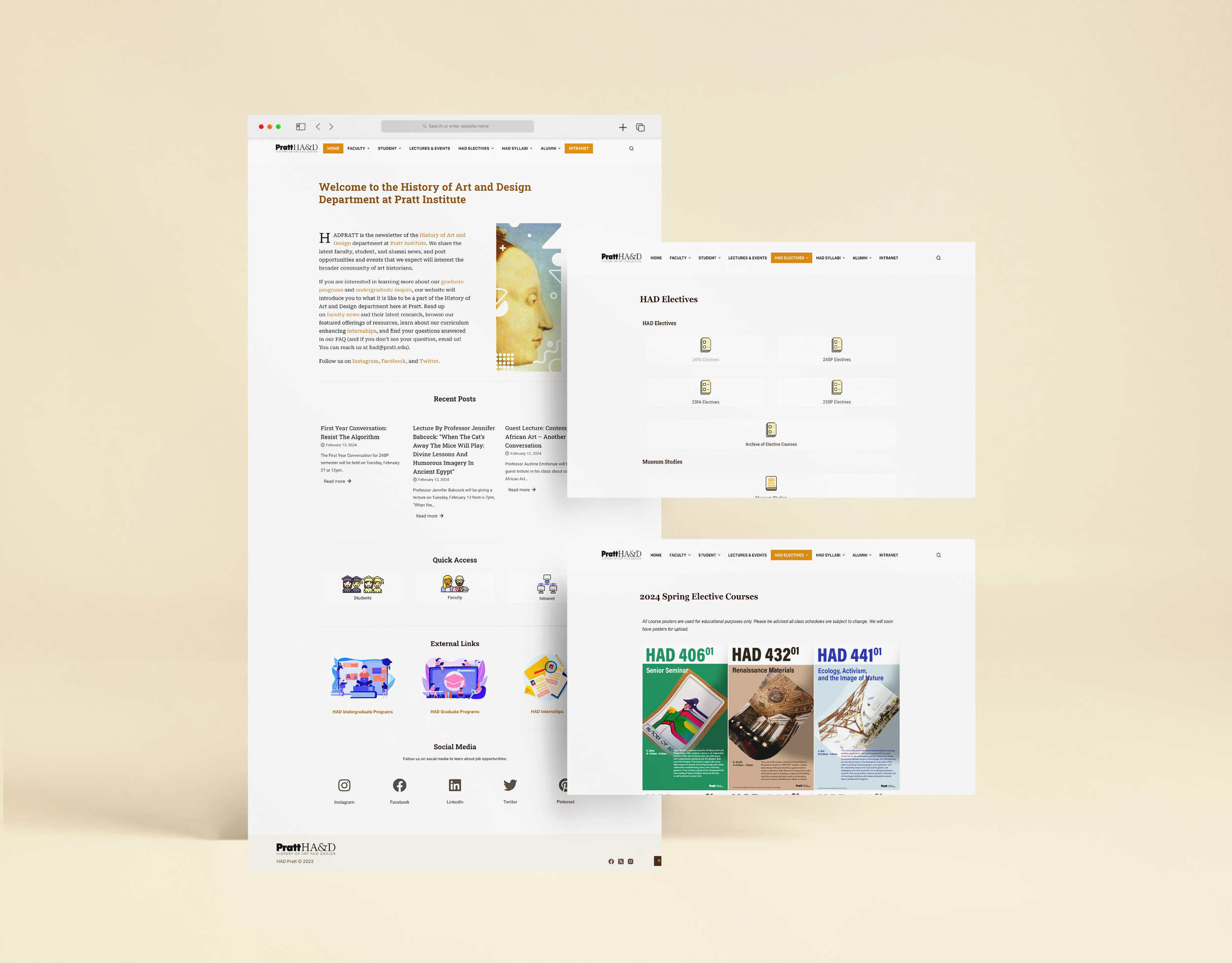
Homepage, Syllabi page and Electives page (click to visit the new had site)
Faculty page, news page and post page (click to visit the new had site)
Towards the regular maintanence of HAD website for accessibility and organized content
The first version of the website was completed in April, 2023. We did not have a chance to test it as it was urgently needed to be launched. However, we reached an increase of 55% user traffic in the first month launching the new website. We are constantly collecting feedback from the department users for further refinements.

Traffic Increase
What’s the future
For a long-term run of the website, our team refined the principles for the future daily management.
-
Revamp the website's structure to be more intuitive and user-friendly. A first-time visitor should be able to navigate the site with ease. This could involve streamlining the menu, improving the search function, and providing clear directional cues that guide users through the Intranet effectively.
-
Overhaul the visual design elements to cater to a wider audience, ensuring that the website is visually accessible to users with diverse needs. This can be achieved by employing a color scheme with sufficient contrast, using larger and more readable font sizes, and offering alternative ways to consume content for those with visual impairments.
-
Establish a daily maintenance routine that includes checking for and applying updates to WordPress core, themes, and plugins. Monitor the website for any performance issues, review security alerts, and fix broken links or errors as they arise to ensure the website operates smoothly on a day-to-day basis.
-
Regularly collect and analyze user feedback, site analytics, and performance data to inform iterative improvements. Stay abreast of the latest web technologies and accessibility standards, and be prepared to adapt the website over time to meet evolving user needs and expectations.
My future managing the website
Now my two teammates have left the team. I am taking the primary responsibility for the website management. I am happy that I have learned how to collaborate with multi-functional team members, stakeholders and excited to see our outcome was successfully delivered and put in use. We had a great cooperation with our department stakeholders. In the future from now, I would require myself to be more proactive with the department’s manager and users. I would need to learn and practise more on communication with stakeholders.