
Design System
Shepherd: Chobani’s design system transforming towards creative brand innovation across Chobani's digital products

PROJECT OVERVIEW
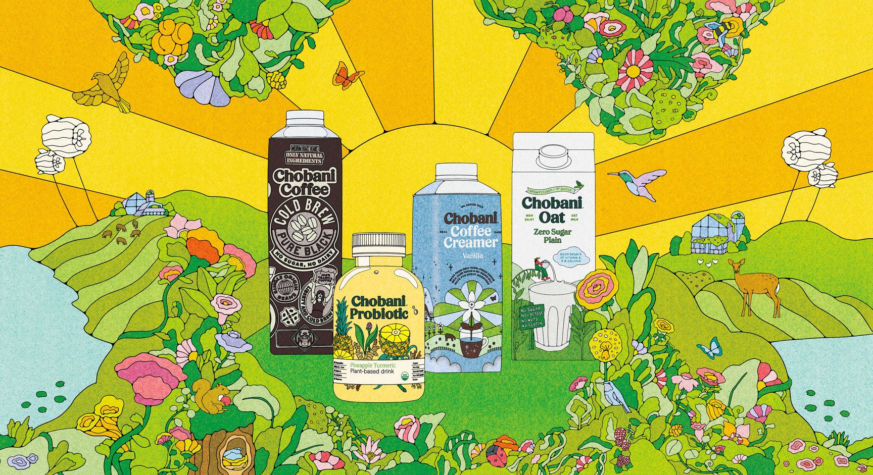
Founded in 2005, Chobani has been pursuing digital transformation in recent years with the primary goal of leveraging emerging technologies to accelerate innovation and advance the business. For their business expansion, we examined current Chobani website and created Shepherd, the design system for Chobani, which delivers significant value towards this goal. Created for stakeholders such as designers and developers, Shepherd facilitates the seamless creation of Chobani’s digital products. It promotes consistency, accessibility, and creativity across Chobani’s digital platforms, positioning the company as a leader in the food and beverage industry's digital evolution.
👩🏫 Role
👥 Team
UX designer
Jennie Lin (Me)
Rishi Mudaliar
Anne Kuo
Shuyang Lin
⏱️ Timeline
🎨 Deliverables
March-May 2024

Process
🖼️ Frame
Identify project framework
🎨 Build
Build the UI kit
Deconstruct UI inventory
🔨 Deconstruct
Document the system
🗂️ Document
Before everything began: Design System Drives Chobani’s Digital Transformation
Founded in 2005, Chobani is renowned for its natural, high-quality ingredients, distinctive branding, and deep commitment to social impact. Traditionally centred around offline retail through conventional manufacturing and distribution channels, Chobani has progressively adopted digital transformation strategies to boost its operational efficiency and engage more effectively with customers. This shift not only optimises its internal processes but also enhances its market reach and consumer insights through advanced digital platforms.
Overall scope of the project

Internal: make the yoghurt maker’s technology function connect and align people across the organisation

External: accelerate branding innovation and further driving the business forward
What’s impeding Chobani’s digital transformation: inconsistency, nonuniformity and inaccessibility
Chobani’s current website was deconstructed into several categories according to the Atomic Design methodology.
In reviewing the current UI elements, two issues emerged as critical barriers:
Inconsistency Despite Strong Branding
Despite possessing a robust branding guide, Chobani faces inconsistency across its user interface. The use of varied UI components for different functions contributes to a disjointed overall experience on the website.
Redundancy & Lack of Standardization
There is a noticeable lack of standardization within the UI components; a single component may appear in multiple variations across the website, primarily for aesthetic appeal rather than functional consistency.
Setting the scope: Establishing a Conceptual Framework to Standardize the System
Keeping the primary challenges in focus, we began by defining the system’s core principles, aligning them with established standards. These principles were crafted to support Chobani’s digital growth, ensuring they reflect the company's values and drive its business objectives forward.
People First
The system ensures all content and interactions are intuitive and universally accessible, embracing inclusivity and clarity at every touchpoint in the design system.
Giving Back
The design system is open-sourced and built for universal use, featuring a clear hierarchy and straightforward instructions for easy understanding and accessibility.


Innovation & Fun
The design system embraces innovative approaches to traditional elements, ensuring a joyful and fun visual design throughout.
Sustainability
Similar to real-life sustainability practices, the system allows users to create interfaces with minimal unique elements. No elements are wasted or redundant.
These principles have guided the documentation process and will serve as the foundational guidelines for future implementations by internal teams.


Our Unique Naming: “Shepherd”
The design system was given the name of Shepherd at this stage. The name derives from the Turkish word “çoban”, which means shepherd in order to acknowledge the founder Hamdi Ulukaya from Turkey. It is aimed to guide every user to build a more accessible and sustainable digital product for everyone.

Addressing Critical Issues through Accessibility Evaluation and Element Usage Assessment
Determining style choices according to accessibility needs
Guided by our core principles, we initiated the design system development by crafting the UI kit. One problem we encountered was the choice of styles, due to Chobani's vibrant and distinctive graphic design branding. A major concern was the potential impact on the brand identity in its online ecosystem if we altered any key style elements.
Image: Various colours in inventory
To resolve this, we shifted our focus to a more practical perspective, prioritising accessibility within the digital product environment. We evaluated all colours and fonts on the current Chobani website against WCAG standards. Colours and fonts that failed to meet accessibility criteria were eliminated. We then selected distinct colours that not only maintain brand consistency but also ensure clear visibility and readability for all users.
Image: Finalised colours in UI kit
Making Trade-offs Based on Component Usage Frequency
Another critical challenge is the complicated decisions about which complicated decisions due to the existing inconsistencies and lack of standardisation, which I was mainly responsible for its solution. Despite the redundancy of some UI elements, they effectively embody Chobani’s strong brand identity and align with the company’s values.
Image: multiple button styles in inventory
My role at this stage involved overseeing the progress, creating checklists, and rebuilding foundational elements such as icons, logos, and components including checkboxes, navigation bars, etc.
To tackle the issue of redundancy, we refined the checklist by analysing the components' usage frequency before beginning the design process. Lacking access to internal usage data, I adopted the stoplight chart method to assess usage frequency using four key metrics: component utilisation rate, frequency of access, reuse ratio, and key function (considered from a designer’s perspective).
Image: component use frequency assessment sheet
💡Elaboration: About the Metrics
Component Utilisation Rate
A high utilization rate, indicated by a component's use once or more per page, suggests importance.
Frequency of Access
Measures how frequently users interact with a component, tied to its primary function.
Reuse Ratio
Assesses a component’s potential for reuse across multiple platforms, highlighting its scalability.
Key Function or Not
Determines if the component is crucial as essential functions, signifying its irreplaceability regardless of its usage frequency.
Following this evaluation, we organized the UI inventory into three sections and 24 categories, each with additional subcategories, to streamline our design system more effectively.

See Shepherd’s UI Kit in Actions
Implementing Design Tokens in Shepherd’s UI Kit
While the UI kit is primarily for designers, we have implemented a design token system within Shepherd to enhance seamless collaboration between designers and developers. These design tokens encompass typography, colors, elevations, and border radius, all of which support flexible customization and direct application. This system ensures consistency and efficiency across design and development workflows.


Set in Stone: Documenting Shepherd for Application
A design system is nothing without proper documentation. After finalizing the UI kit, we utilized Zeroheight to translate the design into comprehensive documentation, creating a centralized resource for the complete Shepherd system. This documentation is fully integrated with our Shepherd UI kit on Figma, adhering to the three principles to ensure clarity and utility:
Concise
The documentation employs succinct language, offering accessible and intuitive guidelines at a glance.
Comprehensive
It encompasses all essential aspects of the design system, including an introduction, governance, design elements, and resources.
Creative
Reflecting Chobani’s unique brand identity, the documentation channels creativity to maintain consistent branding across all elements.
To see more about the documentation, click here: Shepherd Design System
The Shepherd design system is primarily design-led, providing flexibility for designers and product managers to further develop and apply the system effectively and accessibly through its documentation.
Business Impact from Consistency & Flexibility and Preparing for Shepherd's Future Launch
-
The Shepherd design system has garnered positive reviews, particularly for being well-organized, comprehensive, and user-friendly. The overall consistency on the site has been improved. However, as we aimed to simplify the system's application, one critical piece of feedback emerged regarding the "lack of control over pre-defined components." Many of the patterns we provided were designed to function independently, which could restrict designers' creative flexibility. Moving forward, I would like to closely examine how these patterns are utilised by designers in real-world applications and adjust the system to offer greater flexibility and enhanced accessibility.
-
Developing the Shepherd design system offered us a fresh perspective on integrating business values into our design strategies in a class project. We were inspired by how the system aligns with Chobani's actual business plans and its potential to provide benefits both internally and externally. Take card components as an example, Shepherd can improve the project efficiency by 65+% using cards (hypothetically). Moving forward, I aim to validate these findings with actual data from the company, turning this initiative into a concrete project that demonstrates real-world impact.
-
Recognising critical in a design system, we understand that their involvement is crucial to ensure the system's practical application and value. I would like to dive into design tokens and learn more about how to bring values to developers and eventually the product. In terms of our own team, I would like to work within a specific role among a design system team, rather than splitting work evenly. I am interested in collaborating with other cross-functional teams—including developers, content writers, managers etc. —to fully develop and refine the design system for effective real-world use.

Critique with other designers

Shout out to our amazing team 🙌 (after pitch)